Hallway makeover   |  At home with Stine

New wardrobe in new hallway


Stine Skjerveggen has her hands full with three young daughters and the complete renovation of a house dating from the 1950s. The house didn’t have a proper entrance hall, which is rather impractical – particularly for a family with young children! They finally created the hallway and wardrobe of their dreams by enclosing an existing covered outdoor space and moving the front door.

Stine Skjerveggen, her husband and their three daughters (7 years, 5 years and 18 months old) live in the Norwegian town of Tønsberg. Stine is passionate about interior design and followers of her enchanting Instagram account have been kept up-to-date, step by step, room by room, on the renovation and transformation of her home. The interior is homely and Scandinavian with personalised solutions.

By Hilde Børresen Istre    Photos Stine Skjerveggen

The hallway

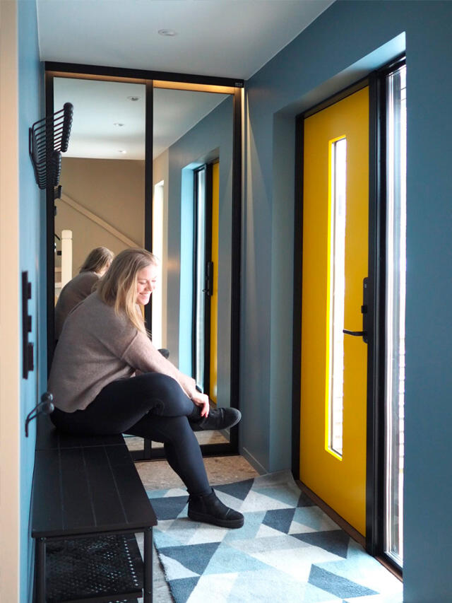
As part of their house renovation project, they decided to move the front door to create a small entrance hall. The new hallway used to be a covered outdoor space. This has been enclosed and the front door has been moved. The room has underfloor heating, tiles and spotlights in the ceiling. – We didn’t really have an entrance hall before, so this was high on the list of what we wanted to do to make life at home a bit more practical. It’s not a massive room, so it was important to find a good, space-saving system for our outdoor clothing and footwear, says Stine. – We have chosen black details for the hallway, such as light switches, coat hooks and a practical bench. The walls are painted blue as I think blue and yellow work beautifully together. What the family desperately needed was a storage system to keep things neat and organised in the hallway. With two girls at nursery school and one at primary school, there is a lot of outerwear. Each of them has rain clothes, overalls, several pairs of footwear, bags, hats, mittens and scarves. All of which needs its own space. The family also wanted a permanent storage space for bicycle helmets, umbrellas and other bits and pieces. This is what the new hallway looked like before the storage system was installed.

Wardrobe solution in Graphite

The wardrobe would be fitted on a wall that is only 120 cm wide, which meant making maximum use of the space and ensuring it is practical for everyone. Out-of-season items and clothing were packed away in the basement to make room in the new wardrobe for the things they use regularly. The solution was to divide the space into two 45-cm-wide sections with pull-out wire baskets for small items, space for hanging up coats and bags, and shelves for frequently used footwear. Hooks were fitted at heights that the girls can easily reach to hang up their own coats. Stine instantly fell for Elfa’s new interior design colour, Graphite. Graphite is a warm brown-black colour with a subtle metallic touch. The colour is unique to Elfa and the effect is softer than totally black wardrobe fittings. – Graphite has really given our hallway the perfect finishing touch. I feel that this is a modern colour that harmonises beautifully with the black frames of the sliding doors. It produces a calm and orderly impression.

Mirrored sliding doors – perfect in the hallway

Sliding doors were essential in this hallway. It was about making maximum use of the entire space from floor to ceiling. Stine chose the Artic Plain sliding door with the Sanded black frame and clear mirror panel. They match the other black features in the room perfectly and look great against the blue wall. The hallway is the first impression that visitors have of your home so it’s worth investing in smart solutions here that are practical for the family and pleasing to the eye. The smooth sliding doors look clean and tidy and hide everything that’s stored behind them. If there is a bit of clutter in there, it’s easy enough to close them when your guests knock on the door. Mirror panels in one or more doors are a practical full-length and they make the hallway look larger. – Even with a pane of glass in the door and a side window in the hallway, it was still rather dark furthest in. As there isn’t sufficient space in the hallway for a wall-mirror, we chose sliding doors with mirror panels. Another advantage is that they reflect a lot of daylight which makes the whole room feel brighter and more spacious.

The result

We’re absolutely delighted with everything! With the design of our solution, how attractive the entrance hall is and also how much tidier it is there. We now have a system that works brilliantly for us in our busy lives! 

We each have our own wire basket and the girls have become really good at putting their clothes in the right place when they get home. What’s more, the sliding doors are just perfect for keeping the hallway looking neat and tidy. Any outerwear that we use less frequently can be hung inside the wardrobe ready for when we need it, which means the coat hooks on the hallway wall don’t get overloaded.

Need inspiration?

Check out tips and inspiration on how to plan your own spacious hallway.

Go to Hallway