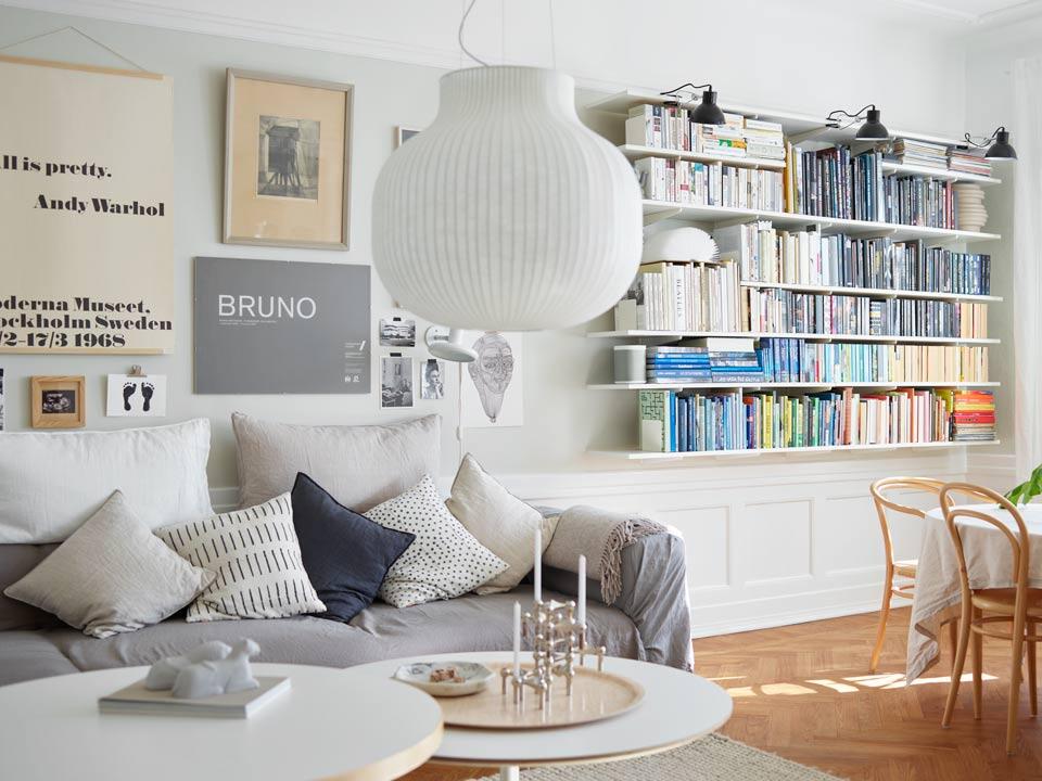


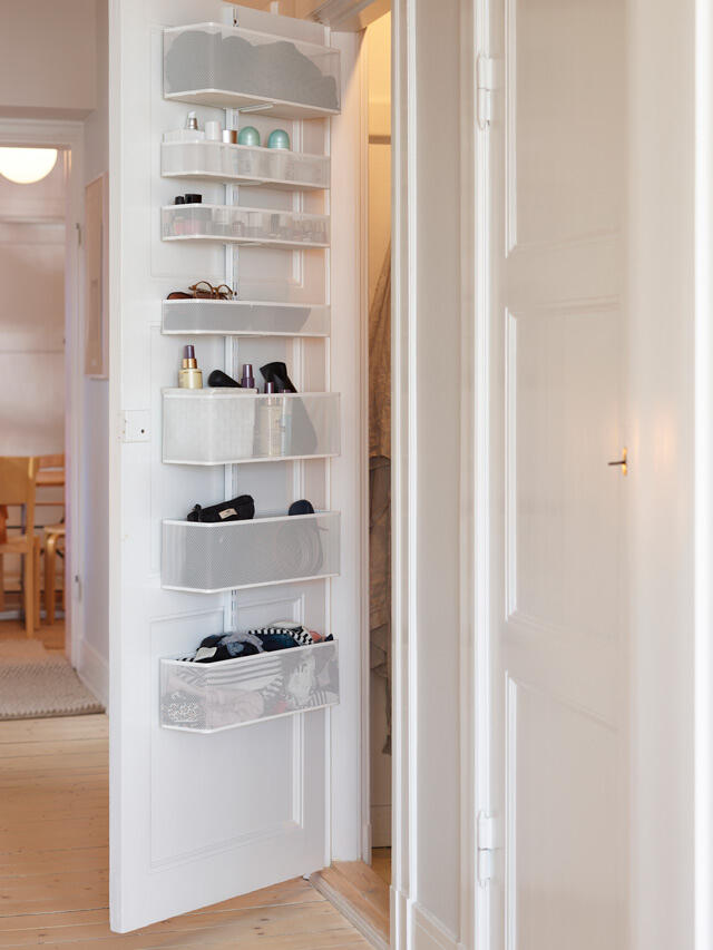
Pantry storage built in-situ, tailored shelving above the wall panelling and smart storage hanging on the backs of doors. Welcome to a home that exudes Scandinavian chic, with pure and simple storage perfection!
Text Charlotta Flinkenberg Photo Fredrik Bjelkerud
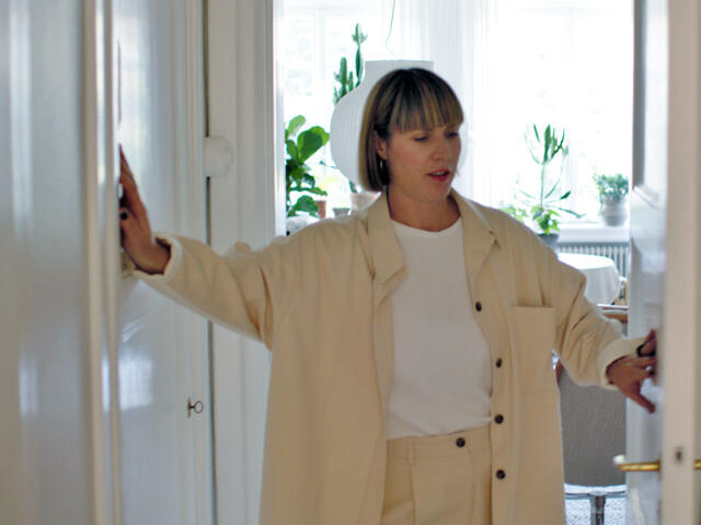

The beautiful 1920s apartment in central Malmö is characterised by a combination of exquisite, low-key aesthetics and sophisticated and pleasing storage solutions. The colour schemes, interior and furniture are the epitome of the expression “Scandinavian Chic”.
“I’ve probably had the most say in what our home should look like,” laughs Josefine Thilhamn, who has spent almost her entire career working in the furniture and interior design industry.
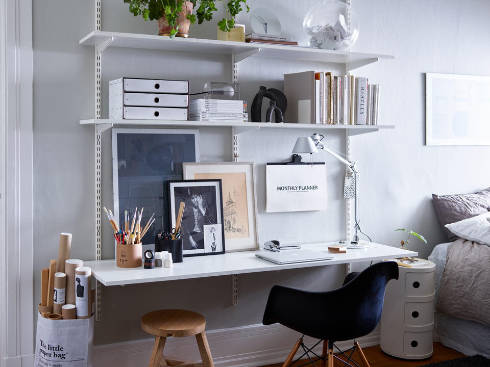
Her partner Sebastian is also very interested, but trusts Josefine’s taste and judgement when it comes to style. You’ll understand why when you see the apartment’s refined sense of harmony and order, despite the multiple gadgets. Elfa’s acclaimed shelving system can be found in all rooms.
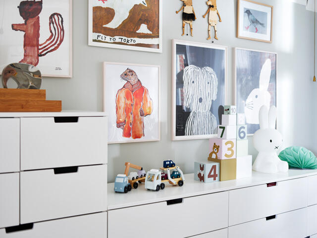
“If you have a lot of items that need storing, you should have a muted colour scheme throughout. This makes a space feel more airy. You can then add attractive pops of colour in accessories. For example, our books are sorted by colour on the shelves to create a calm mood. It’s a look that suits the atmosphere of our home.”
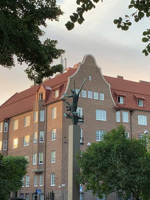

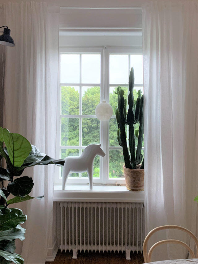

The couple fell in love with the location of the apartment, its 1920s charm, fantastic original lattice windows and the beautiful view over an old cemetery.
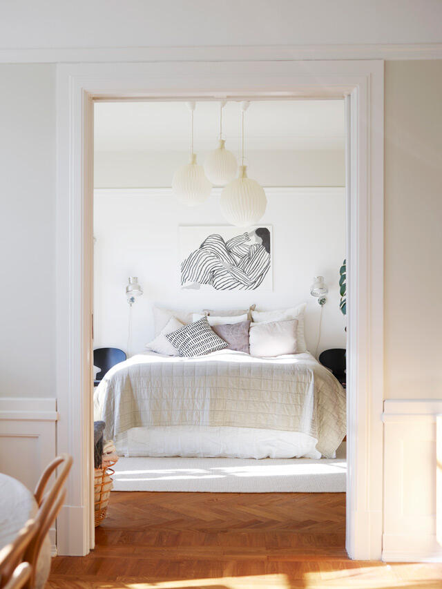
“Original details have become almost an obsession of mine. Beautiful floors, original doors and windows must remain in place. People often move the kitchen to a living room or incorporate an adjoining room to create a larger bathroom. I think it feels best if the layout is left as it was originally intended.”
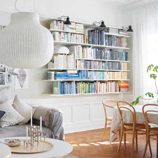

The apartment with 123 square metres of living space had plenty of potential, but needed carefully and completely renovating before they could move in one year ago.
“We want to live in the centre of Malmö, but can’t have a larger place than we can afford. This means maximising storage in a smart way.”
You have installed Elfa’s storage systems in all the rooms of your apartment. How do you manage to harmonise the contemporary and modern look of the storage with the older style of the apartment?
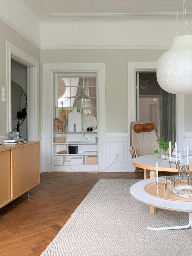
“The trick is to be guided by the architecture. The best thing about Elfa’s shelving system is that it is flexible and can be configured and modified to suit the space. Elfa’s system makes good use of the wall space above the panelling in the living room. The dimensions can be adjusted almost to a millimetre.”
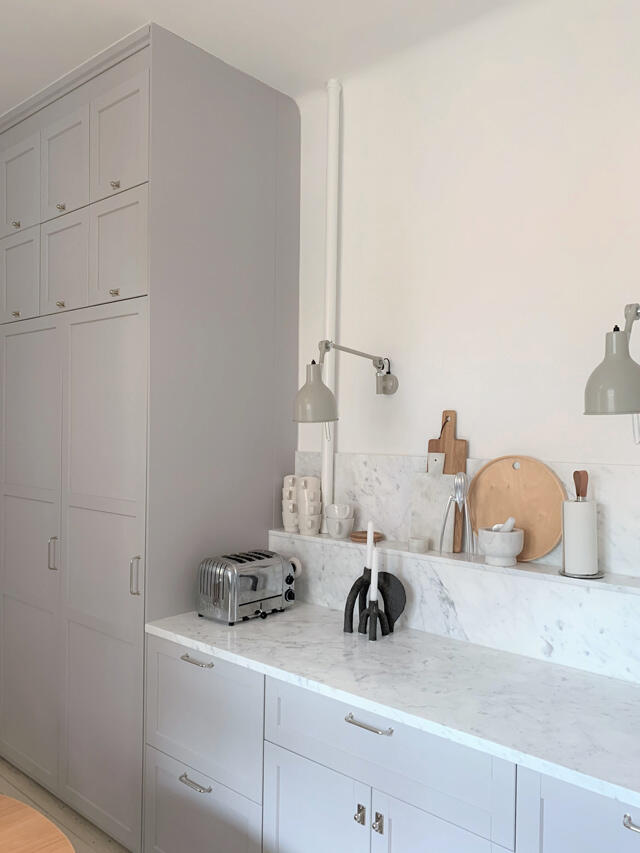

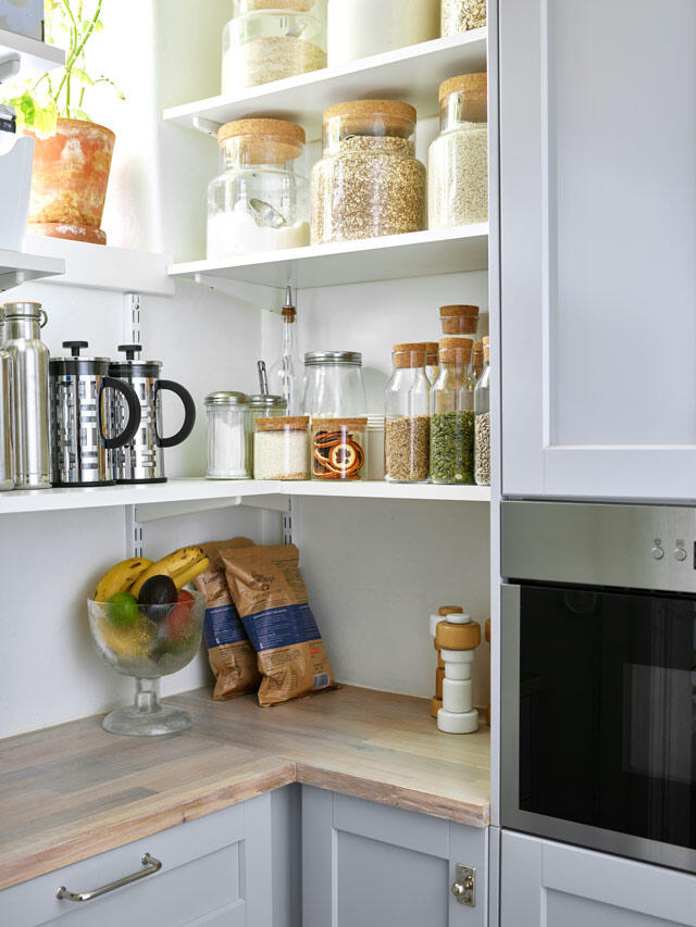

Do you have any good organisation and storage tips for smaller spaces?
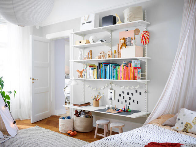
“Try to extend your storage all the way up to the ceiling. That’s useful in the kitchen, for example. We’ve done that in our kitchen and pantry space too. A gap between the top of the kitchen cupboards and ceiling gathers dust, is difficult to clean and tends to draw the eye. You achieve a more balanced effect by building storage all the way up. Make use of unusual places, such as the back of doors, where quite a lot of extra storage can be created for small items.”


Josefine
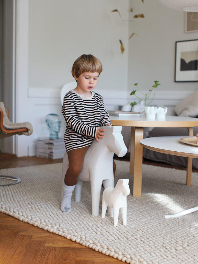



It would be easy to suppose that Josefine and Sebastian have always preferred the pared-back Scandinavian style, considering how they’ve decorated their home. But their previous décor preferences were a mix of varied styles.
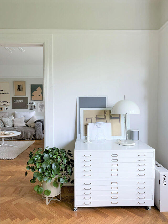
“Sebastian grew up in Mexico surrounded by lots of colour. In our previous apartment we had patterned wallpaper. Here, we wanted to let the ornamental ceilings, high skirting boards and wall panelling guide the style and use a calm colour scheme for a uniform look.”
How did you decide on the colour palette? It must have taken time?
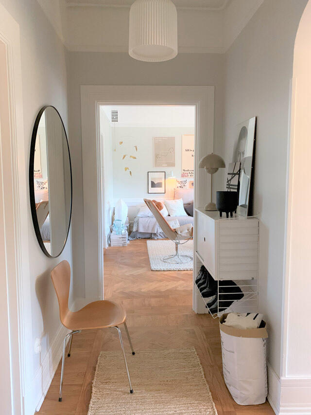
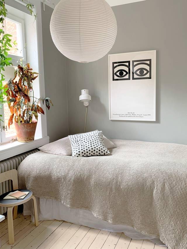
“It certainly did! I probably bought 40 samples and painted and taped paper samples to all the bedroom walls. It looked like a patchwork quilt. I eventually narrowed it down to five shades. Some of them we’ve used in several places throughout the apartment. The long narrow spaces, such as the hall and corridor, are in the same shade. The living room is the same shade as the bedroom ceiling. It creates a harmonious and calming feel.”

Josefine




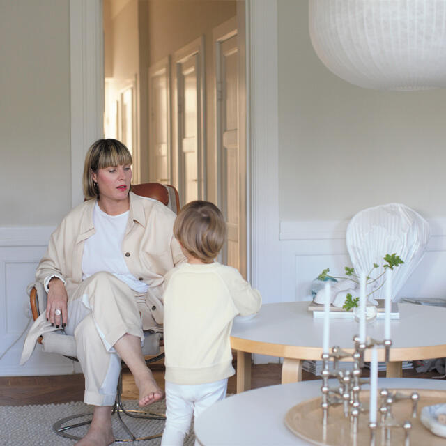
Josefine and Sebastian, age 39, and their two-year-old son Alvar live in a 1920s apartment in central Malmö.